In this article I will talk about image histograms, what they are, and how to use them. People usually get terrified after the first look at them. Image histograms look like those terrible mathematical graphs we were so happy to forget after graduating! Yes, they are graphs, but they are very easy to interpret. And they are extremely helpful in photography once you learn some very simple basics!
First of all, what do they give us? Imagine yourself shooting at a bright sunshine. You took a shot and look at it on the small camera display. You want to know how good the exposure is, if you managed to get the complete dynamic range of the scene lighting. What do you see? Not too much… The screen is simply too small to really evaluate an image. In addition, that awful sunshine converts the screen into a mirror, and you hardly see anything… Except the histogram, which you can easily show with a single button press on Nikon DSLRs. The histogram is usually visible even in such difficult conditions, because the camera manufacturers make sure to use good contrasting colors. And from this histogram you learn how good the image exposure is much better than even from looking at this image on a large computer screen! If the exposure is sub-optimal, you immediately see how to improve it from the image histogram. Take another shot, check the histogram again… And so on until you get the perfect exposure.
Now that you know why image histogram is so useful, let’s get over the scary part: learn what the histogram is. But first we need to know what an image is, how it is represented.
An image is a set of pixels (points) of different colors. Pixels are so small that we don’t distinguish them, they blend together producing a complete image. In colorful images, every pixel’s color is described by several values representing the percentage of primary colors mixed to achieve this color. But let’s first look at monochrome images for simplicity. In monochrome images, every pixel is represented by a single gray level intensity value, which describes how bright it is. 0 means there is no light at all, thus it is the black color. The maximum value in the range (which is often 255) means that the maximum possible amount of light is applied, producing white color. Middle values (usually around 127) are middle-gray colors.
Image histogram is a graph plotting the frequency of occurrence of different color intensities in the image. Simply put, it shows how many pixels of every possible color there are in the image. Every bar on the image histogram represents one intensity level. 0 (black) is usually shown on the left, and 255 (white) on the right. Look at how high the bar is, and you see how many image pixels have the corresponding color. Let me give some examples.
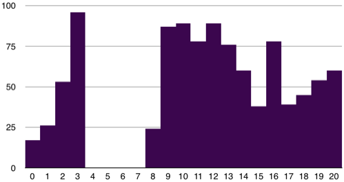
First, for simplicity, let’s imagine our image has a reduced intensity range, say 0 (black) to 20 (white). 10 is middle gray, and 5 is dark gray. The sample histogram shown below means that in our image, there are 17 black pixels with intensity 0 (left-most column), 26 almost black pixels (intensity 1), 53 pixels with intensity 2, and 96 pixels with intensity 3. Then we have a gap: there are no dark-gray pixels with intensities 4, 5, 6, and 7. Then 24 pixels with intensity 8, etc., till 60 white pixels (intensity 20). And that’s all there is in the scary histogram! Just the number of pixels of various colors!
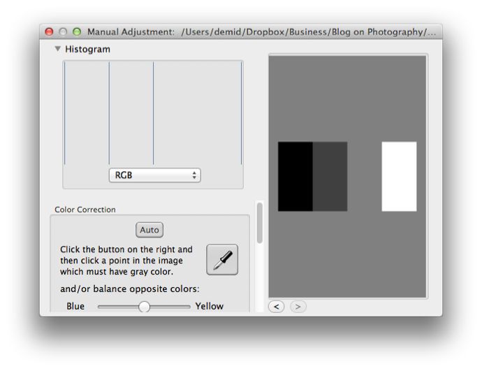
Now let’s look at more realistic examples. The following image contains four gray lines of the same width. This image is open in the Photo Sense‘s Manual Adjustment window, which also shows its histogram. There are only four colors present in the image, the same number of pixels of every color. This is obvious from the histogram, which shows four bars of the same height.
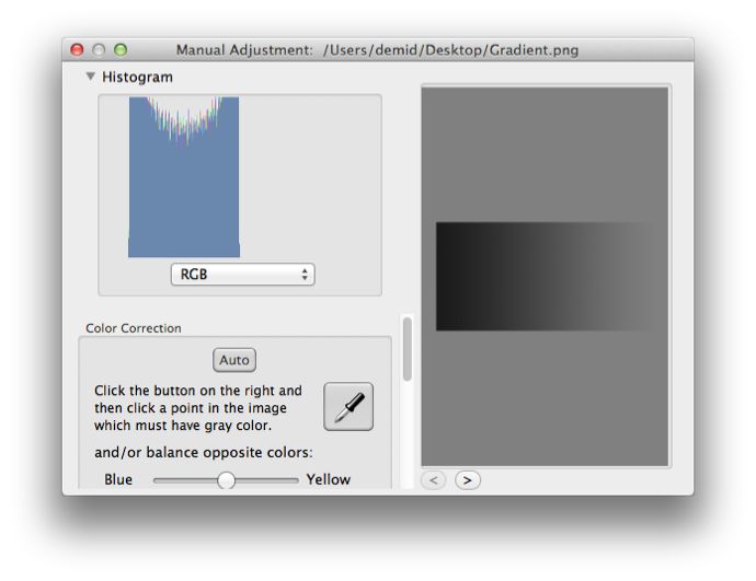
The following image contains a gradient from dark gray to middle gray. Again, you can see only dark to middle gray values in the histogram.
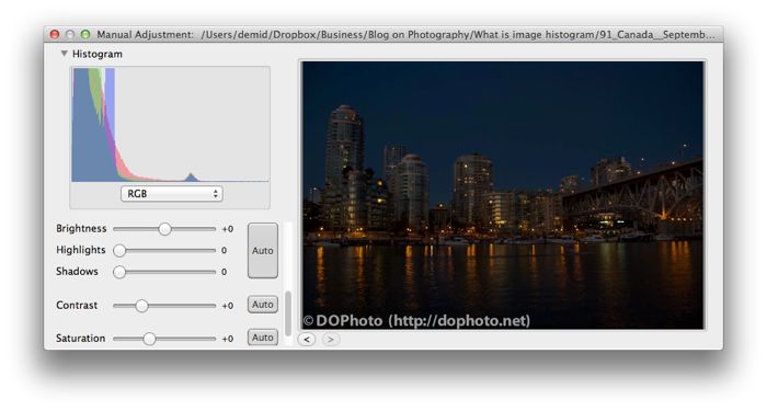
Finally, let’s look at real photos. They are colourful, and the histogram shows all its color channels: red, green, and blue. What can you see from the following image’s histogram? Most of the colors are at the left side of the histogram, which means they are dark. We can conclude, looking only at the histogram, that the image is in general very dark, underexposed. And it is indeed the case. If, while shooting, you do not see the image itself well enough for some reason, take a quick look at its histogram to evaluate the exposure. Now you know what to do: increase exposure (reduce the shutter speed, increase the aperture, and/or increase the ISO speed) and shoot again!
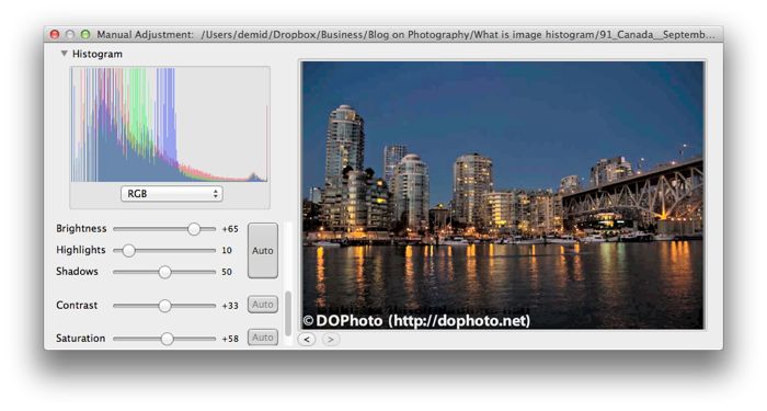
If it is too late to re-shoot this photograph, try to improve its exposure in software. This photo is shown again below after it was automatically processed in Photo Sense, with brightness boosted even further manually. You can see that many intensities moved to the right in the histogram, showing that the image became much brighter.
While shooting, I always look at histograms to check exposure. Nikon DSLRs can be configured to show a large easy-to-read histogram on a single button press. I don’t use separate color channel histograms, a single luminance histogram is quite enough to check exposure.
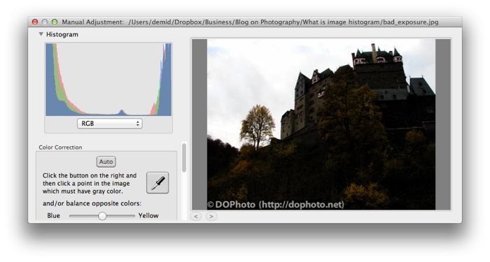
What exactly do I look at? First of all, I try to make sure that the histogram is not “cut” on either dark or bright side. If a substantial amount of image data approaches a histogram side and is suddenly “cut” at the edge, it means that the camera clipped some values, failed to capture all the data. The following example shows an extreme case, when the histogram is cut both on the left and right sides. We lost details in the sky, a large part of which is clipped (completely white). We also lost details in the clipped dark shadows, which are completely black. And we cannot restore the lost data by adjusting the image brightness in software, because this data is clipped, it is all just solid white or black color. We cannot retrieve details in the clouds and in the shadowed land unless we draw them ourselves.
In most cases, you will have only one side clipped. It is usually easy to fix by adjusting exposure. Increase exposure if the histogram is clipped on the left side, decrease exposure if it is clipped on the right side. You might also want to consider adjusting exposure if the histogram is not clipped, but you see that the image is in general bright or dark (as in the first photograph). This, however, is not always a good idea. For example, when doing night photography, you will naturally get dark photos with the histogram shifted to the left. Only make sure that the histogram is not clipped, and you are fine.
The previous example, however, illustrates the case when the camera is simply unable to capture the whole dynamic range of the scene. The sky is too bright and the land is too dark compared to each other, the camera cannot capture both of them with a single exposure. The image histogram is clipped from both sides. If you improve one side by adjusting the camera exposure, it will degrade the other side even more. This is more difficult to solve, you will probably need to do exposure bracketing to create a High Dynamic Range (HDR) composition from several exposures. We will cover HDR photography some time in future.
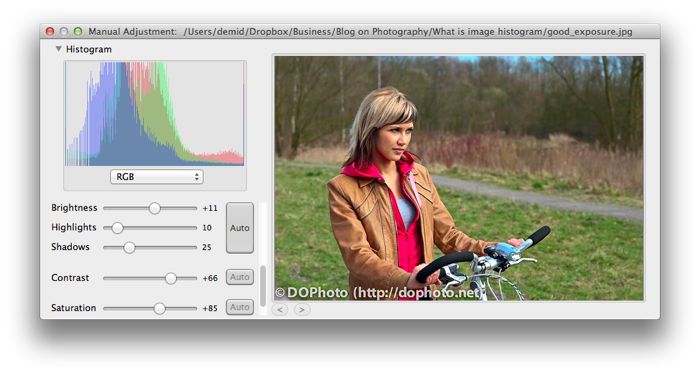
After all, what kind of histograms should we aim to achieve? If you are shooting in normal conditions (not special conditions like in darkness), you in general wish to get more or less evenly distributed intensities in the histogram. The following example shows what I consider a close to perfect histogram which I try to achieve when shooting.

One might say that this “perfect” image lacks contrast, which is also visible from the histogram: there are only a few dark and bright pixels. However, this is very easy to fix to your liking in software when post-processing. The following example shows the same photo processed (mostly automatically) in Photo Sense. The photo became much more contrasty, the histogram is stretched to fill in also the dark and bright slots.
Do not forget that when shooting, you are not creating a photograph, you are only collecting all the available visual information, as much of it as possible. Later, using this information, you create a photograph in software post-processing. It is the same process as used to be before the digital era. If you fail to get enough details while shooting, you missed the photograph: software is unlikely to help you a lot, or at least you will need to spend tremendous amounts of time to “draw” the missed image data. And image histogram is the best tool helping you to make sure you have captured a sufficient amount of data while shooting. But not having a perfect (contrasty, vibrant etc.) photograph straight from the camera is absolutely normal and should be expected, that’s why Photo Sense and other image editing applications exist!
Don’t forget to check out!

Photo Sense: Photo Manager & Editor for Mac